A material starting point
The identity’s palette comes from olive glass and uncoated packaging, creating a connection between product and presentation.
An identity for the small rituals that make a day.
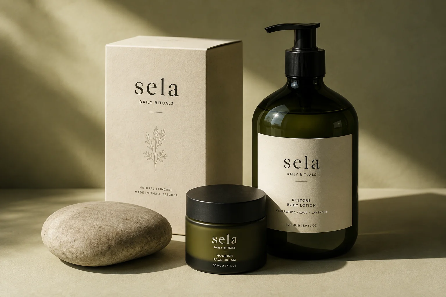
Self-initiated studio concept. This is not commissioned client work. Product photography was generated for this identity exploration.
01 The thinking
Sela is a natural-skincare concept built around simplicity and care. The brief asked how a small range could feel coherent across packaging and a digital shop, with a visual identity that stays recognizable at different scales.
Olive glass, paper tones, and a soft serif wordmark establish the material vocabulary. The proposed e-commerce direction carries those choices into generous product imagery, concise product descriptions, and a calm visual hierarchy.
Everyday care, considered.
Warm language, useful product information, and a little room for yourself.
The identity’s palette comes from olive glass and uncoated packaging, creating a connection between product and presentation.
A compact wordmark anchors both the small label and the larger digital composition.
The storefront direction gives photography and product information distinct roles, leaving room to compare and understand a small range.
Next project